Back in May 2020 an old colleague and friend (Claire Ingle) reached out to see if I could help create a visualisation/dashboard of a survey that Claire and her colleagues at Fertility Matters at Work had commissioned from Eight Consulting. I was flattered to be asked so I quickly agreed. I finally found some spare time over the course of a few Sunday mornings (whilst my other half was on early morning kid duty) to start pulling it together.
I was keen to share my design approach as the visualisation of this data took some time to get it to where it needed to be and more importantly ensure that Claire and her Fertility at Work partners were happy with the output.
I think people underestimate how long visualisations take to put together and despite working with Tableau for nearly 5 years now it still takes me a while to get it looking just how I want it, the perfectionist in me means I create a lot of iterations and constantly tweaking different bits until I am happy.
I haven’t loads of experience visualising survey data so first task was to understand the data and play around with what it was telling me so I could pull out the key points and hopefully ensure these were clear in the presentation. I tried various charts to ensure each survey question results helped the viewer quickly see the results and what they mean.
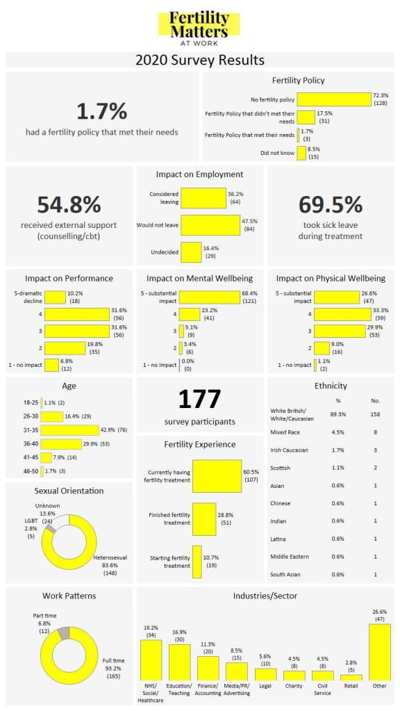
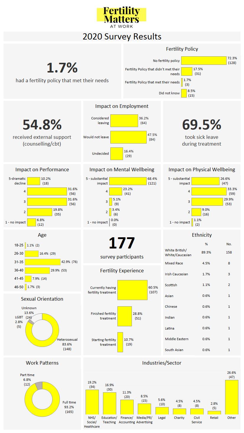
In this instance I felt there were a few really key questions that would benefit from BANs (big as* numbers), and the other ones needed simple bar charts to help compare the % across the various answer options.
There were two big challenges with this data:
- Getting everything on one page. I spent a long time working out the best way to lay it out, and adapting the dashboard sizing so each element was big enough to see.
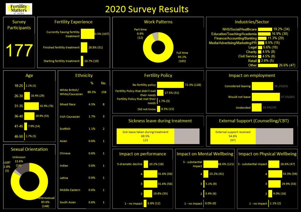
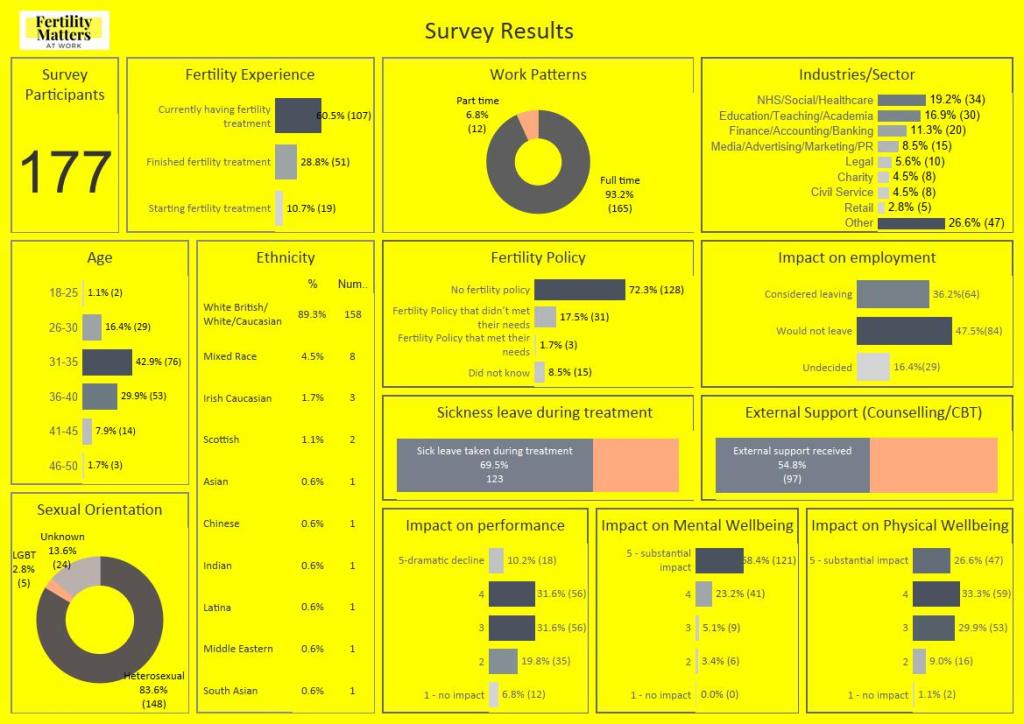
- Colour scheme – I started with the logo as was keen that it blended well with the overall design. So used the yellow from the logo and checked what colours worked well with yellow and ended up choosing a light grey. Although you will see below that it wasn’t my first choice. I wanted to see if black background or even yellow background worked. Yellow was a definite no no, and the black just didn’t feel right for the subject matter. Plus Clare wasn’t keen at all! So played around with a light grey, utilising the logo yellow for the charts.
Once I settled on the general layout I then tried to make sure the charts ‘popped’, after version 3 (well probably more like version 10 at this point) as shown below I decided on putting borders round the bars/edges in the charts to see if that looked better. I think without this the yellow and white just seem to merge too much, and it’s not as crisp. I also tried borders round the actual charts versus no borders, and again as you will see I decided on the borders to split up the survey questions.
I sent my final viz to Claire for her to review and check in with her colleagues, and they were really happy. The only final change they wanted was the survey results to be at the top rather than the survey participant info. So I flipped this (I say flipped but if you have worked with Tableau you will know it’s not quite that simple but still easily done, just time consuming). I finalised this and sent Claire a JPEG of the viz that they wished to use to combine with their other other survey outputs.
Few examples below of the iterations this viz went through….


Since then I have tweaked the viz again so I could share on Tableau public, so I added some context, identified data source to credit those responsible for the collection, and flipped the survey info to the top so that it leads you into the questions.
It is strange revisiting a viz and updating it 6 months after you created it, as now I am really critical of it. There are probably loads of other ways to present this data, but sometimes you just have to put your pen down and move on!
Feedback for the viz and blog welcome
Thanks for reading
Ella
Discover more from Dataliciously Ella
Subscribe to get the latest posts sent to your email.

I appreciate how you carefully considered color schemes and layout for optimal readability.
LikeLike